plot(size.meas$JL, size.meas$SCL)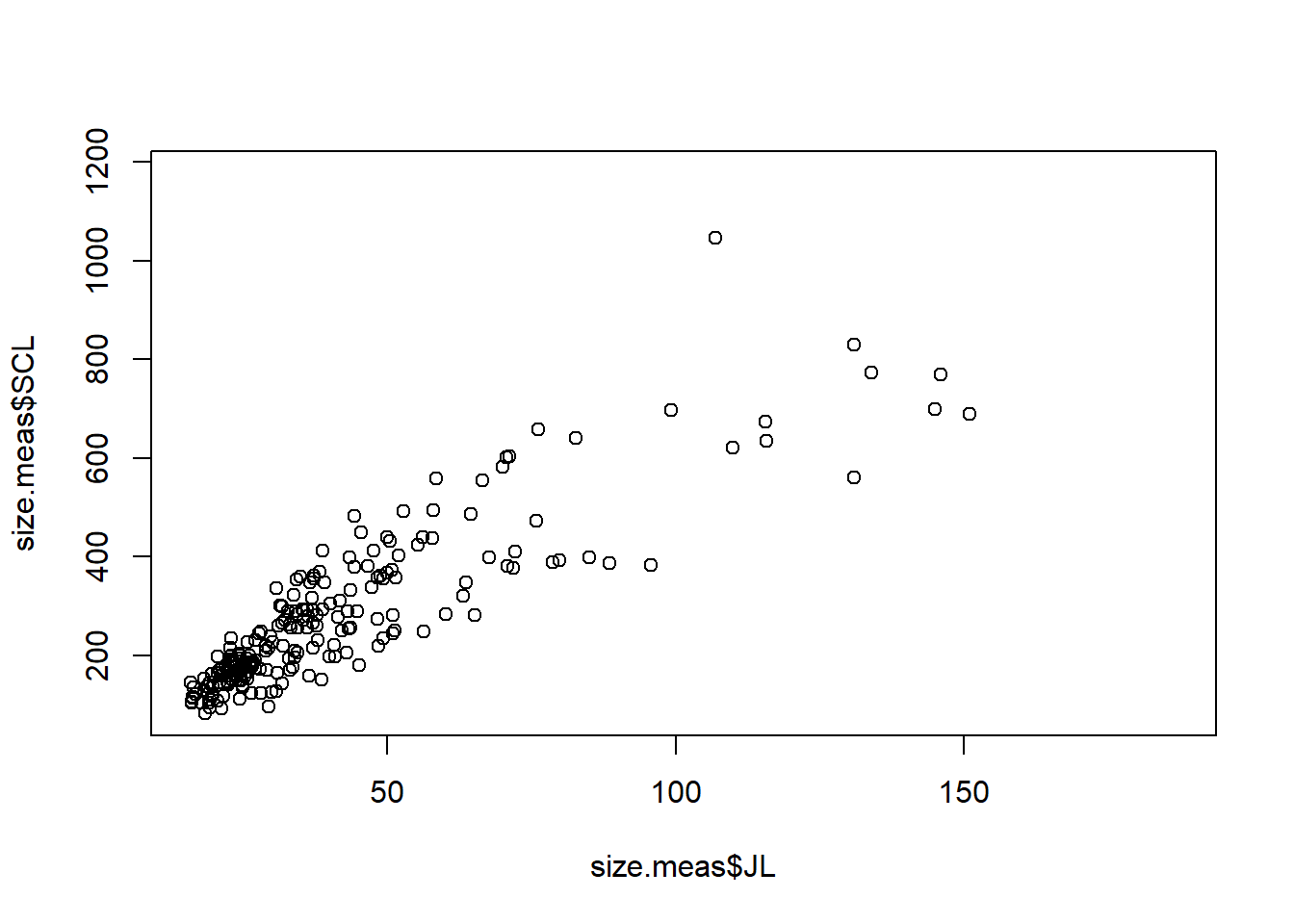
Of course R is more than just a simple calculator. One of the great benefits of using R is producing high-quality plots to visualize your data and results. R has many built-in functions for plotting, and there are also several packages available that extend R’s plotting capabilities, such as ggplot2 and plotly.
Even though those packages allow the user to create nice plots with less code, it is always good to know the basics of plotting in R using its built-in functions. Knowing the basics of the bult-in functions enables greater flexibility and control of the output.
The plot() function is one of the most commonly used functions for creating scatter plots, line plots, and other types of visualizations and it can be modified in many ways to customize the appearance of the plots. Let’s use the same dataset we used in the Subsetting section to create some basic plots.
First, let’s create a simple scatter plot to visualize the relationship between the jaw length (JL) and straight carapace length (SCL) of the turtles in the dataset.
plot(size.meas$JL, size.meas$SCL)
There is a lot of empty space in this graph, so we can limit the area shown using the xlim and ylim arguments to set the limits for the x and y axes, respectively.
plot(size.meas$JL, size.meas$SCL,
     xlim = c(15,95),
     ylim = c(80,610))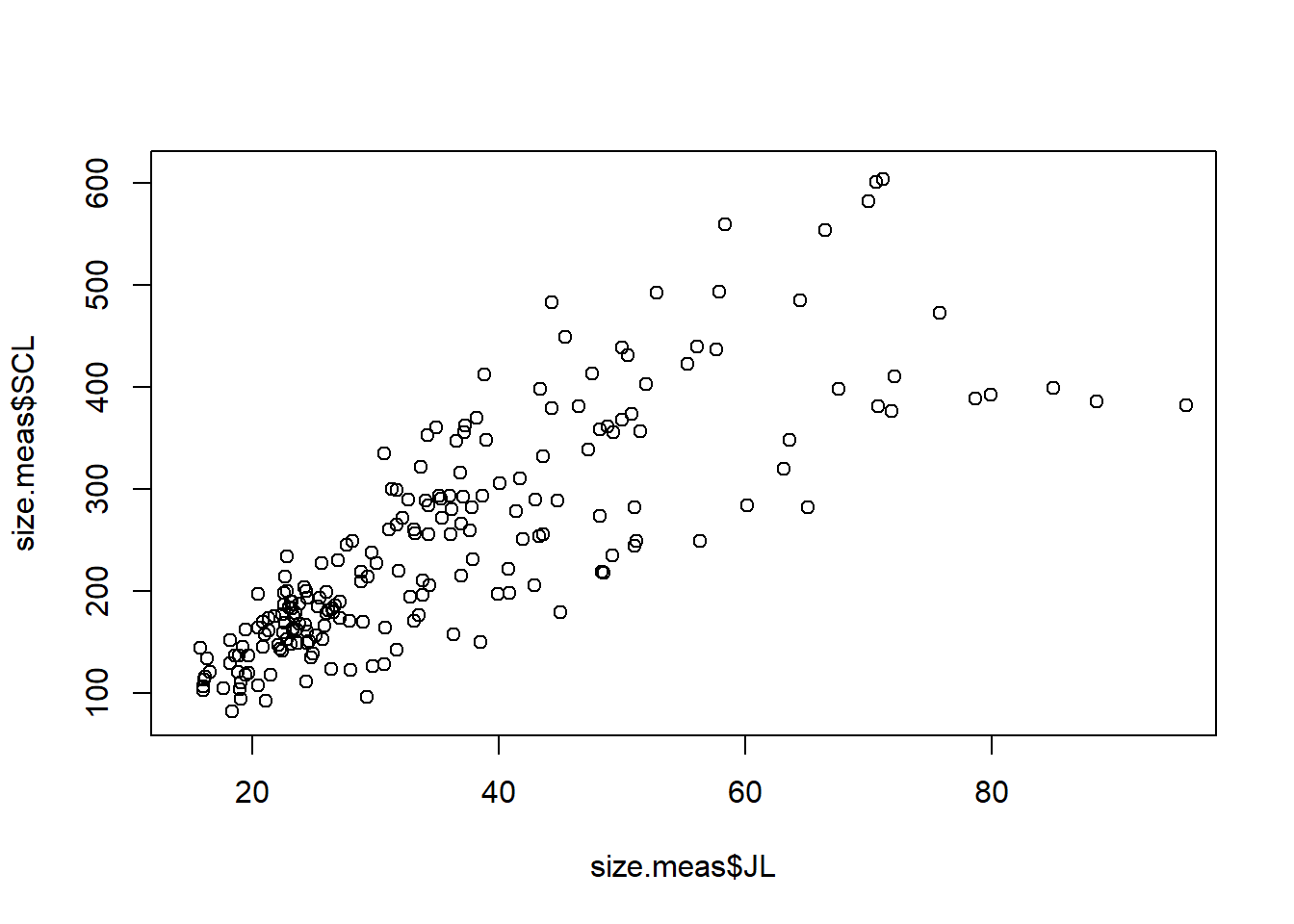
We can also add labels to the axes, a title and a subtitle to the plot using the xlab, ylab, main, and sub arguments.
plot(size.meas$JL, size.meas$SCL,
     xlim = c(15,95),
     ylim = c(80,610),
     xlab = "JL (mm)",
     ylab = "SCL (mm)",
     main = "Jaw Length vs. Carapace Length",
     sub = "Published data from Ferreira et al. (2024). Biol. Lett.")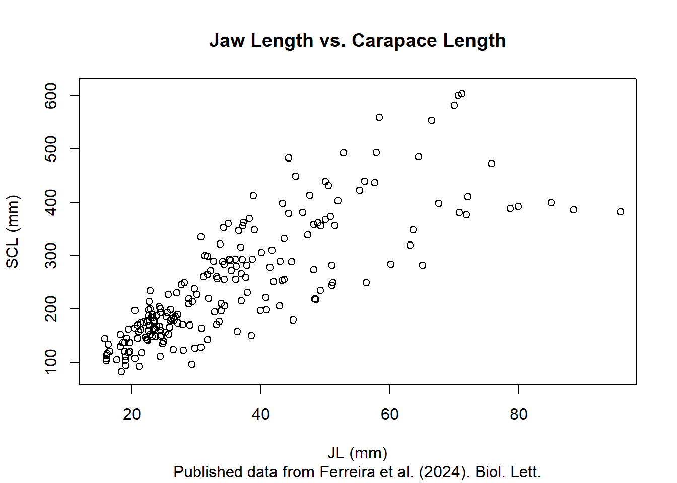
The plot() function takes a great number of arguments (definitely check ?plot to see some of those), allowing you to change all the pieces of a graph. For example, changing color and shape of the points can be done using the col and pch arguments, respectively, and bty changes the layout of the graph. The family of arguments cex adjusts the scale of different elements of the plot, such as points, text, and labels.
plot(size.meas$JL, size.meas$SCL,
     xlim = c(15,95),
     ylim = c(80,610),
     xlab = "JL (mm)",
     ylab = "SCL (mm)",
     main = "Jaw Length vs. Carapace Length",
     sub = "Published data from Ferreira et al. (2024). Biol. Lett.",
     bty = "l",
     col = "blue",
     pch = 19,
     cex = 1.5,
     cex.main = 1.2,
     cex.sub = 0.6,
     cex.lab = 0.8,
     cex.axis = 0.8)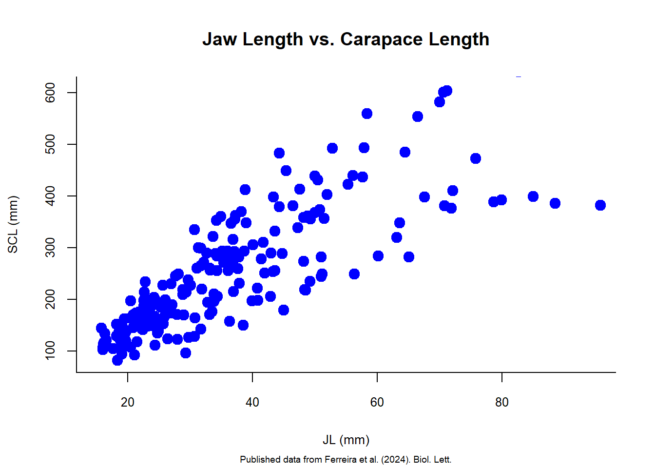
There are different point types that can be used in R. You can check them all using the ?points help page. Here are some examples:
par(mfrow = c(3,3), mai = c(0.5,0.3,0.3,0.3))  ## set the plotting area to a 2x3 grid
for (i in c(1:6, 21:23)) {
  plot(size.meas$JL, size.meas$SCL,
       xlim = c(15,95),
       ylim = c(80,610),
       xlab = "",
       ylab = "",
       main = paste("Point type:", i),
       pch = i,
       col = "blue",
       bg = "red",)
}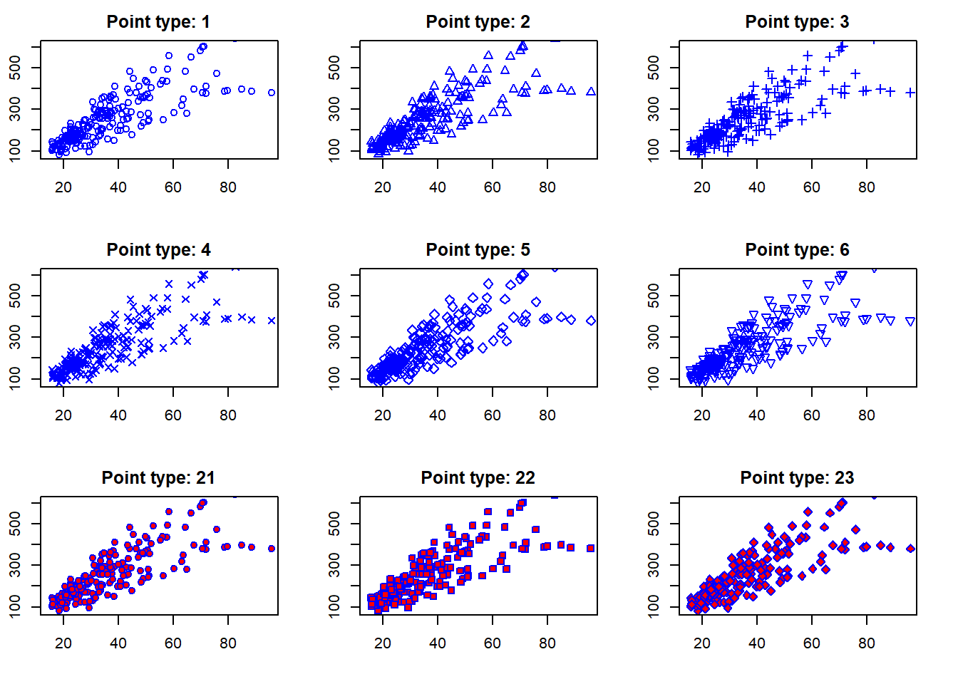
Above I used a for loop to create multiple plots with different point types (a sequence including 1 to 6 and then 21, 22, and 23). Note that I used two arguments for changing the colors, col and bg. The col argument changes the color of the point border, while the bg argument changes the background color of the points (only for point types that have a background, such as 21 to 23 in this example).
par() is a powerful function that can be used to control graphical parameters across all subsequent plots. In the example above, I used the argument mfrow = c(3,3) to set the plotting area to a 3x3 grid, allowing us to display multiple plots in a single figure.
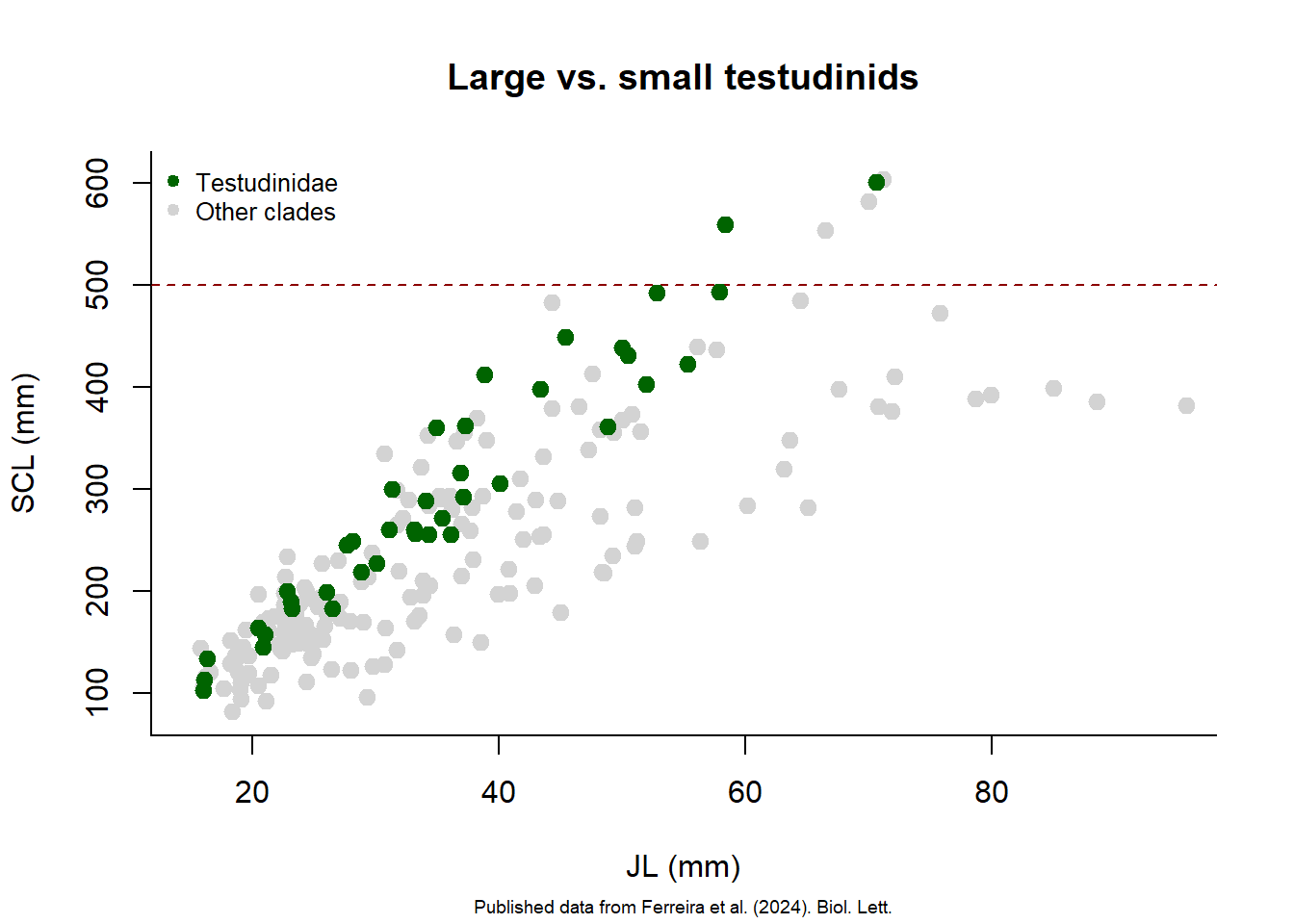
After creating a plot, you can add more elements to it using functions like points(), abline(), and text(). For example, let’s add a line separating larger turtles (SCL>500 mm) from all others, highlighting species of the Clade Testudinidae with a different color and create a legend.
plot(size.meas$JL, size.meas$SCL,
     xlim = c(15,95),
     ylim = c(80,610),
     xlab = "JL (mm)",
     ylab = "SCL (mm)",
     main = "Large vs. small testudinids",
     sub = "Published data from Ferreira et al. (2024). Biol. Lett.",
     bty = "l",
     col = "lightgray",
     pch = 19,
     cex = 1.2,
     cex.sub = 0.6)

abline(h = 500, col = "darkred", lty = 2)  ## add horizontal line at SCL = 500 mm

testudinidae <- size.meas[size.meas$Clade == "Testudinidae", ]  ## subset Testudinidae

points(testudinidae$JL, testudinidae$SCL,
       col = "darkgreen",
       pch = 19,
       cex = 1.2)

legend("topleft",
       legend = c("Testudinidae", "Other clades"),
       col = c("darkgreen", "lightgray"),
       pch = 19,
       bty = "n",
       cex = 0.8)