boxplot(size.meas$SCL, ylab = "SCL (mm)")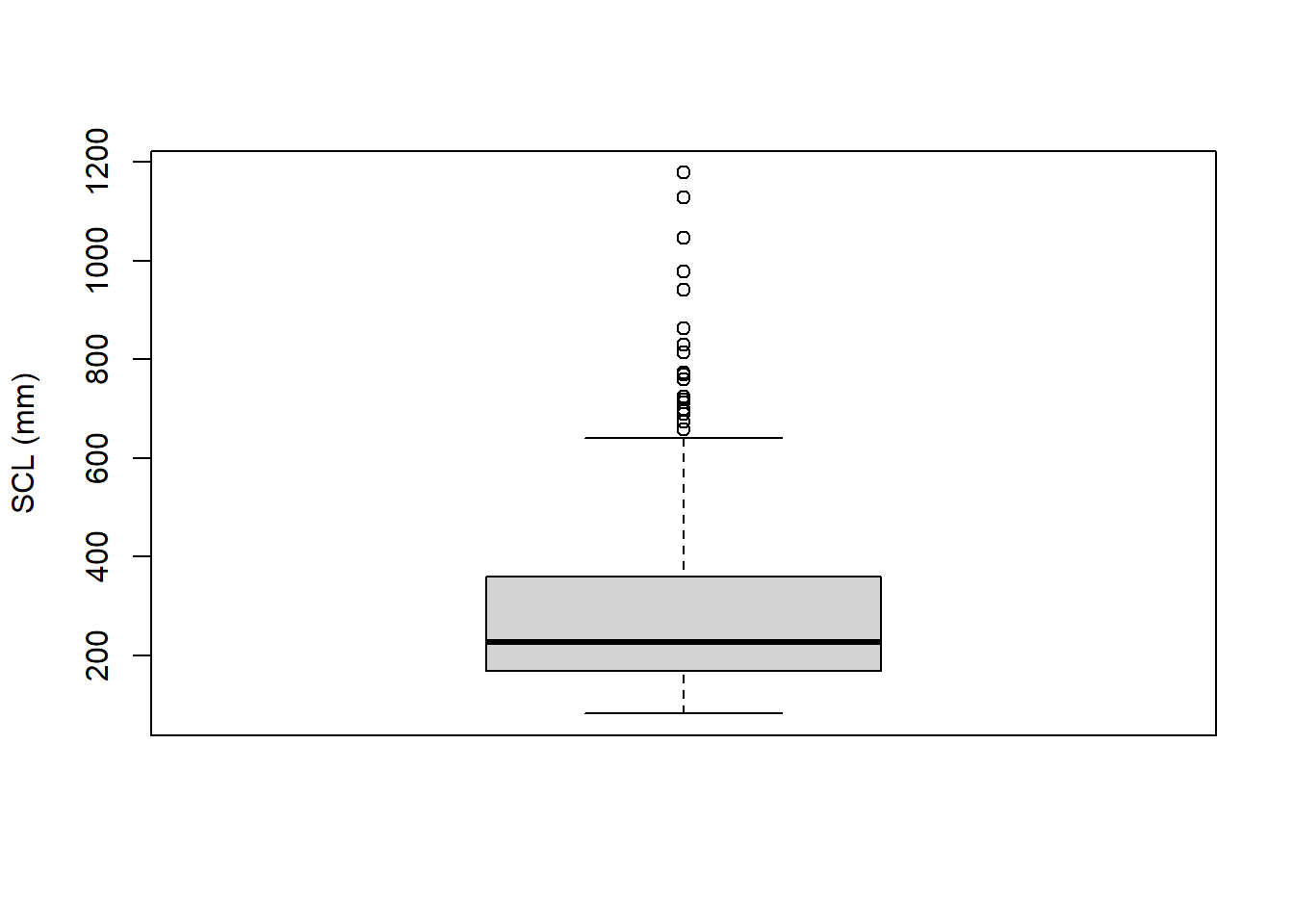
R includes built-in functions other than plot() for visualizing distributions of data, such as boxplots and histograms. Both boxplots and histograms are useful tools for visualizing the distribution of numeric data, and they can provide insights into the central tendency, spread, and shape of the data. A boxplot (or box-and-whisker plot) summarizes the distribution of a numeric variable by displaying its minimum, first quartile (Q1), median, third quartile (Q3), and maximum. A histogram, on the other hand, shows the frequency distribution of a numeric variable by dividing the data into bins and counting how many observations fall into each bin.
Boxplots can be created using the boxplot() function. Let’s use the Ferreira et al. (2024) dataset to create a boxplot of the SCL variable:
boxplot(size.meas$SCL, ylab = "SCL (mm)")
As for the plot() function, you can customize boxplots by adding titles, changing axis labels, and modifying colors. It is also possible to create boxplots for multiple groups by specifying a formula interface. For example, to create boxplots of SCL grouped by Clade, you can use the following code:
clade.colors <- rainbow(length(unique(size.meas$Clade)))
boxplot(SCL ~ Clade, data = size.meas,
        main = "SCL by Clade",
        xlab = "Clade",
        ylab = "SCL (mm)",
        col = clade.colors,
        cex.axis = 0.6,
        cex.lab = 0.8)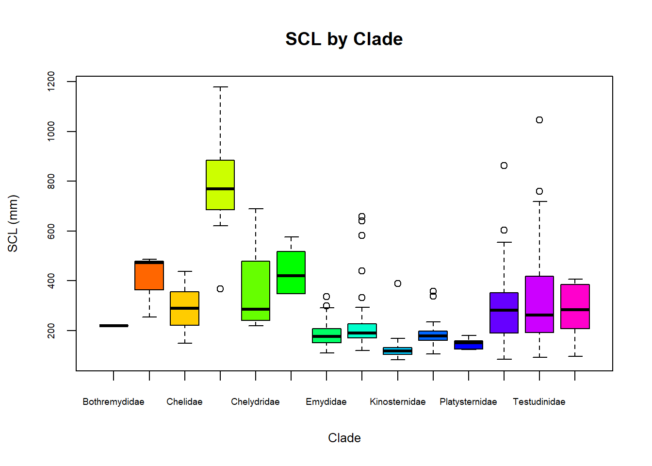
Note that, in this case, we used the formula SCL ~ Clade to specify that the SCL values should be grouped by Clade and defined the dataframe using the data argument. We also created a vector of colors using the rainbow() function to assign different colors to each clade. As for the n argument (number of colors), we used the length() of unique() clades in the dataframe.
Histograms can be created using the hist() function. Let’s create a histogram of the SCL variable from the same dataset:
hist(size.meas$SCL,
     main = "Histogram of SCL",
     xlab = "SCL (mm)",
     ylab = "Frequency",
     col = "lightgray",
     border = "black")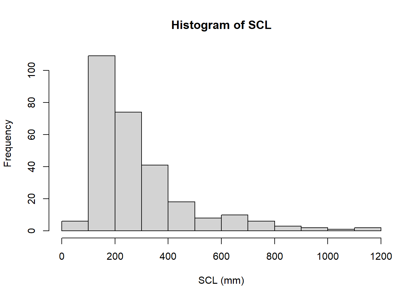
You can customize histograms by changing the number of bins using the breaks argument, adding titles, and modifying colors. For example, to create a histogram with 20 bins, you can use the following code:
hist(size.meas$SCL,
     breaks = 20,
     main = "Histogram of SCL with 20 Bins",
     xlab = "SCL (mm)",
     ylab = "Frequency",
     col = "lightblue",
     border = "black")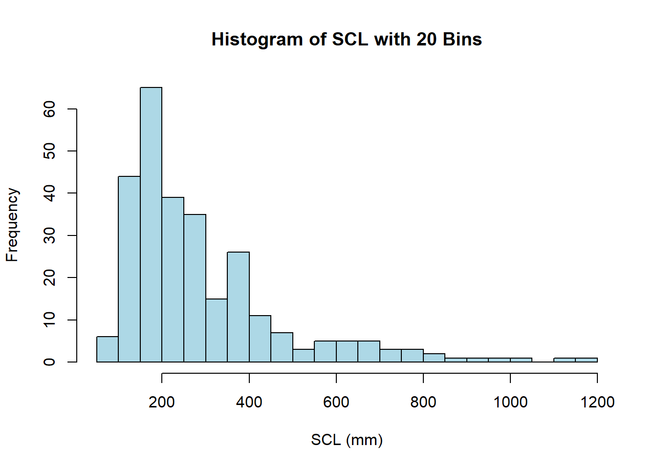
Note that, even though we specified 20 bins using the breaks argument, R may adjust the number of bins slightly to better fit the data (this is explained in the documentation of the function). If you want a specific number of bins, you can define a vector of breakpoints instead. For example, to create a histogram with bins of width 10 mm, you can use the following code:
hist(size.meas$SCL,
     breaks = seq(0, max(size.meas$SCL, na.rm = TRUE), length.out = 10),
     main = "Histogram of SCL with Bins of Width 10 mm",
     xlab = "SCL (mm)",
     ylab = "Frequency",
     col = heat.colors(length(seq(0, max(size.meas$SCL, na.rm = TRUE), length.out = 10))),
     border = "black")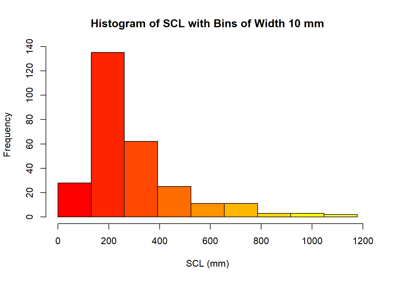
In this case, we used the seq() function to create a sequence of breakpoints from 0 to the maximum value of SCL, with a specified number of bins (10 in this case), given as the length.out argument. We also used the heat.colors() function to generate a gradient of colors for the bars in the histogram, using the length of the previous sequence as the number of colors.